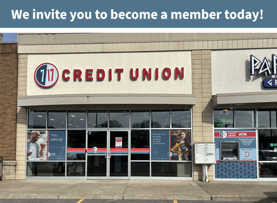
Q: Why are you refreshing your brand?
A: Like the communities we serve, our organization has evolved. It is a best practice for businesses to review and refresh their visual branding from time to time, and it has been nearly 20 years since 7 17 has done so. With a need to replace aging signage and a decision to develop a new website, it was time to review the overall brand.
We extensively analyzed our existing brand through focus groups, surveys and interviews of members, non-members, and employees. The research showed that all audiences had a consistently positive view of 7 17’s organizational culture and the quality of the financial solutions provided. It also revealed that it was time for a visual update.
The brand refresh, which is a visual change only, will help position 7 17 Credit Union for continued growth and communication with future borrowers in the communities we serve.
Q: Have you changed your name?
A: No; the legal name of the credit union – Seven Seventeen Credit Union, Inc. – has not changed. However, for brevity and for the cleaner, more modern look it provides, you will see that we use 7 17 Credit Union in our promotional and media relations materials. We also took a nod from many of our members who had been using 7 17 Credit Union when corresponding with us.
Because our legal name remains unchanged, you will continue to see Seven Seventeen Credit Union written out on disclosures, applications, notices, and some forms.
Q: Is the new color scheme meant to symbolize something specific?
A: A number of color palettes were tested and a mix of vibrant red and slate blue were the preferred primary colors for our new look. Red represents the strength of 7 17 Credit Union as one of the largest credit unions in not only Ohio, but the nation. It also represents the energy and enthusiasm that we have for serving our members and working to try to help them meet their financial objectives. The calming, light and friendly slate blue balances the red’s energy and represents stability and trust. Over the course of the past 60 years, 7 17 has built great stability, and we are rated among the healthiest credit unions in the country. Trust is what we strive for every day from our members.
Q: Is the new logo meant to symbolize something specific?
A: To create a cleaner, more modern look, the new logo utilizes the numerals “7” and “17” separated by color. The circle that surrounds the numerals symbolizes our common bond. As a financial cooperative owned by our members, not stockholders, our focus has always been on the best interests of our membership.
Q: 7 17 has a new tagline: “Respectfully. Yours.” What does it mean?
A: Our new tag line gives nod to that timeless salutation with punctuation that adds additional meaning. “Respectfully.” describes the essence of how we operate as an organization: how we make decisions, interact with our members and with the 7 17 family of employees, and how we get involved with the communities we serve — the very communities in which we live and work.
“Yours.” reflects our focus on you, our member-owners. As a credit union and financial cooperative (unlike a bank), we’re not beholden to generate stockholder profits. Instead, we make decisions based on what’s in the best interest of individuals that have selected 7 17 as their financial partner. As a member of 7 17, the Credit Union truly is yours.
Q: Why are we still seeing the old logo or old name in some places?
A: The current logo and imagery is found in many places and on many items. Transition costs will be minimized by updating materials as they are depleted. While you will start seeing the changes in earnest around mid-April, you might start seeing the logo before then due to the timing of when certain items need restocked or reprinted, or if new materials are introduced. Likewise, you will likely continue to see the current logo on items for some time afterwards.